Living Proof Restore Recovery Regimen:
After bleaching my hair to death, I was getting pretty desperate for something to fix it. Now, I know enough about hair to know that you can't really heal damaged hair... the most you can hope for is something to bind to it well enough to keep it on your head while the damage grows out. So, I started with somewhat expensive treatment - Living Proof Restore Recovery Regimen.
I bought mine at Sephora, and it comes with some pretty lofty claims:
What it is:
A nourishing, anti-damage, four-week regimen
formulated to repair hair that is frequently colored, chemically
processed, heat styled, or over-stressed.
What it does:
This regimen restores straw-like,
extremely damaged hair to optimal health by increasing strength, shine,
softness, and manageability. Its concentrated formula penetrates the
cortex to infuse it with keratin protein while patented ingredients
recondition and smooth the cuticles. The result: superior strength with
enhanced softness and shine and a return to optimal hair health.
Experience instant improvements after your first dose.
It says it is a four week regimen, but it comes with 5 tubes of product. They include the extra tube so people with very thick or very long hair will have enough, and if you don't have very thick or very long hair, then you get a bonus week.
Here is my hair before. It is washed and blow-dried straight. It looks ok in the picture, but in real life it was very stiff, coarse, poofy and poodled. It was both gratifying and frustrating that the damage wasn't showing up on camera very well.
After the 5 weeks, it looked the exact same when blow dried. So, my after picture is of my hair air dried. The point I want to get across with the "after" is that it became much softer with the treatment. What had felt very straw-like before was now silkier.
So, here it is after:
Visually, it didn't change much. I think my hair is just too damaged for this. It did soften my hair, so it wasn't so coarse.
Overall, I think my hair was too damaged for this product to be enough to really help much. I won't use it again.
Aphogee Two Step Protein Treatment:
Immediately after the "after" picture, I applied Aphogee Two Step Protein Treatment. I felt like this product really helped my hair. I bought mine at Sally's, and because I have long hair, I purchased the large bottle of the protein treatment, and the large bottle of the balancing moisturizer.
To use, apply to shampooed, towel-dried hair. You saturate the hair with the solution, and then comb it through. After that, you are supposed to use a hooded drier to dry the hair. I don't have one, so I used a blow drier. Let me tell you, that took FOREVER! And, be sure you comb the solution through, so that your hair clumps into smaller groups, and not just 4 or four large clumps of hair. If you let it stay in a big clump, then it will take even longer to dry! So make sure you comb it to get the strands as separated as possible. Once it starts to dry, it is very important that you don't manipulate the hair. They warn that your hair could break off because the solution hardens so much. If you have long hair, whatever your hair is touching, it is going to stick to. I recommend wearing a tank top or other light weight shirt that you can get in the shower and wear it while you rinse your hair out. It is very uncomfortable to have that solution dripping, and your hair sticking to you. Ugh. If it didn't work so well, I'd tell you to forget about it just because it is such a pain in the rear.
Ok, so after it's all dried and rock-hard, you get in the shower and let warm water run over it for 2 minutes, and then gently rinse your hair. After you have it all rinsed out, you apply the moisturizer, wait for 5 minutes, and then rinse it out.
Here is my hair after:
It is a lot shinier, and feels a lot better. I will definitely use this again, but I plan to get a hood drier before doing so.
Finally, I have been trying all sorts of conditioners, trying to find something to really moisturize my hair. So far, the best one has been Aussie Three Minute Miracle Conditioner. It gives my hair enough slip to be able to easily comb through, and that has helped lead to far less stretching and breakage. So that's a short review on the conditioner, but if you have really dry hair, you might want to check it out. It's less than $5 at Wal-Mart. I still use deep treatment masks and oils, but this has become my everyday conditioner.
Friday, July 12, 2013
Wednesday, July 10, 2013
GUEST POST! Review! Stila Palettes - Dare to Bare -and- Not So Nude
Today's guest post is from Michelle, who came across a killer deal and messaged me to tell me about it! I asked her if she would write up what she thought of them for a guest post, and lucky duckies, she did!
I don't make it home to visit friends and family very often, but on this trip, I met my childhood friend, Mickie, and her family at Ulta so that she and I could do some shopping and bonding over makeup. We came across these Stila palettes on sale. Normally $20 each, they were on sale for $15 and came with a small sample tube of Stila mascara. The three palettes are Dare to Bare, Not So Nude, and The Natural. I picked up Dare to Bare, mostly because I gravitate towards the neutral browns for my everyday look and Mickie has been telling me I need a bronzer for awhile and that palette included one. I am totally new to bronzer. I liked this palette (and the price) so much I ended up going back for Not So Nude. (My friend liked hers so much, she went back for The Natural.)
These are my first Stila products and I really love these palettes. I'm loving the colors enough that I would pay full price to replace them when I finish these. I know Sugarpot Beauty dislikes cardboard palettes and that's what these are (with a magnetic close) but, seeing as I'm on vacation right now, I think these are perfect for throwing into your toiletry bag to have some basic, essential colors with you that will achieve varied looks, without having to take along a whole lot of makeup. They're also great if you want to experiment with new looks or colors without breaking the bank. I'm enjoying my first Stila experience and look forward to trying more from this brand!
I don't make it home to visit friends and family very often, but on this trip, I met my childhood friend, Mickie, and her family at Ulta so that she and I could do some shopping and bonding over makeup. We came across these Stila palettes on sale. Normally $20 each, they were on sale for $15 and came with a small sample tube of Stila mascara. The three palettes are Dare to Bare, Not So Nude, and The Natural. I picked up Dare to Bare, mostly because I gravitate towards the neutral browns for my everyday look and Mickie has been telling me I need a bronzer for awhile and that palette included one. I am totally new to bronzer. I liked this palette (and the price) so much I ended up going back for Not So Nude. (My friend liked hers so much, she went back for The Natural.)
Dare to Bare:
Dare to Bare swatched:
Not So Nude:
Not So Nude swatched:
The swatch photos were taken outside. As I said, I'm out
of town and the lighting at my grandma's is pretty terrible. Some of the
eyeshadow colors blend right in with my skin so they're really nice as
base eyelid shades to even out the lid's color. The other, darker shades
are very buildable, so you're able to go darker, if you prefer. I've
been using the Dare to Bare colors over e.l.f.'s eyelid primer and
they've held up well over the course of a hot Texas day. I imagine
they'd be amazing over a higher quality primer like Urban Decay's
potion.
Here, I'm wearing Étude House's Precious Mineral BB
Cream Bright Fit, which has SPF 30, important in the Texas sun. Over the
e.l.f. eyelid primer, I'm using Dare to Bare's "au natural" all over
the lid, "native" on the lid and into the crease, "earthly" in a line
just above Mosha Katani's sormeh eyeliner in "charcoal brown" and just
under the sormeh on the bottom lashes, too. There's just a bit of
"double dare" on the lid, as well. (The palette says to apply these wet
for a more intense look, but I used them dry.) I'm using the "wink"
bronzer, "birthday suit" as a shimmer/highlighter, and "lily," from the
Not So Nude palette, as a blush. The cream blush is intended to be used
on the lips, as well, but it had too much shimmer for my tastes, for
lips, at least, and I opted for lipstick instead. On my
lashes is Dior's mascara because I had a sample I brought with me on our
trip. On my lips is bareMinerals' marvelousMoxie lip liner in
"exhilarated," and their lipstick in "Get Ready."
These are my first Stila products and I really love these palettes. I'm loving the colors enough that I would pay full price to replace them when I finish these. I know Sugarpot Beauty dislikes cardboard palettes and that's what these are (with a magnetic close) but, seeing as I'm on vacation right now, I think these are perfect for throwing into your toiletry bag to have some basic, essential colors with you that will achieve varied looks, without having to take along a whole lot of makeup. They're also great if you want to experiment with new looks or colors without breaking the bank. I'm enjoying my first Stila experience and look forward to trying more from this brand!
Monday, July 8, 2013
Review! Urban Decay Ammo Eyeshadow Palette
Urban Decay recently re-did their Ammo Palette. Therefore, they have their old Ammo palette on sale on their site for a measly $12. You really can't go wrong here...
The colors for the old Ammo palette and the new Ammo palette are exactly the same. The new palette has their new formulation, but their old formula is still pretty good. The colors are nicely pigmented, and are soft and smooth. They blend very nicely and even the white shade (Polyester Bride) doesn't go chalky. Plus, you really can't go wrong for $12.
After all the matte palettes I have been reviewing lately, it was a shock to get back into bold, shimmery, glittery colors. I find myself using these shades as pops of color and sparkle, and am not using them to create a complete look (meaning, I use other palettes in conjunction with this one).
All of the colors are shimmer with glitter. The glitter won't stick without a sticky base, so you'll need to apply it while your eyeshadow primer is still tacky. To really make it stick, try Fyrinnae's Pixie Epoxy underneath. (You can see my review of Pixie Epoxy here) If you don't use a good base, you will end up with glitter all over your face.
I don't use the sponge applicator, but it would help avoid fallout that occurs on the trip from the pan to the eyelid.
I totally recommend snapping up this palette at this awesome sale price!
The colors for the old Ammo palette and the new Ammo palette are exactly the same. The new palette has their new formulation, but their old formula is still pretty good. The colors are nicely pigmented, and are soft and smooth. They blend very nicely and even the white shade (Polyester Bride) doesn't go chalky. Plus, you really can't go wrong for $12.
After all the matte palettes I have been reviewing lately, it was a shock to get back into bold, shimmery, glittery colors. I find myself using these shades as pops of color and sparkle, and am not using them to create a complete look (meaning, I use other palettes in conjunction with this one).
All of the colors are shimmer with glitter. The glitter won't stick without a sticky base, so you'll need to apply it while your eyeshadow primer is still tacky. To really make it stick, try Fyrinnae's Pixie Epoxy underneath. (You can see my review of Pixie Epoxy here) If you don't use a good base, you will end up with glitter all over your face.
I don't use the sponge applicator, but it would help avoid fallout that occurs on the trip from the pan to the eyelid.
I totally recommend snapping up this palette at this awesome sale price!
Friday, July 5, 2013
Review! Stila Convertible Color in Peony
I've been trying out Stila's Convertible Color in Peony.
It is a pretty color, but I think this color is more of a fall and winter shade for me, as I prefer brighter pinks in the summer.
It is a matte cream, with no shimmer at all. The cream is very smooth and melts onto the skin easily. The think I really like about cream blushes, versus gel or powder blush, is that is is much like a foundation/concealer. It takes the place of foundation on my cheeks because it will cover most minor imperfections.
Here it is in the pan, in indoor lighting. This is fairly true to how it appears in real life.
Natural light... A word about today's swatches; I applied as much as I would on my face to create the swatch. I could have really piled it on so it would show up better in the photos, but because that isn't now much you would apply, I didn't think it would be helpful. So, if you are having trouble seeing the swatch, it is directly in the center of this photo:
Indoor lighting.
Because it is supposed to be a convertible color, I took it for a test drive (haha, a pun!) on my lips. Here we are with one thin coat:
And two thin coats:
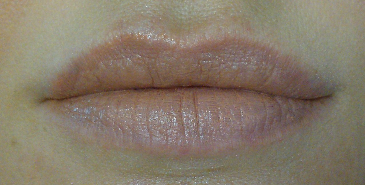
This has been one of my favorite nudes for the lip. It doesn't wear for very long - perhaps an hour or two - but it fades evenly and blends well with lip balm. It does take a bit of finesse to get the layer applied evenly, but it has the perfect blend of peach, rose, and brown to go perfectly nude on me.
Here it is on the lip and cheek:
Here it is on the cheek:
So, would I recommend it? While I am put off by the price tag, a little bit goes a long way. I bought mine as part of a larger blush assortment, so mine is a much smaller trial size. This little trial pan that I have is going to last a very long time, so it does give good value for the money. So, because it has good staying power on the cheek, can pull double-duty as a lip color, and is so pigmented, I say give it a try.
Wednesday, July 3, 2013
Review! Urban Decay Lip Junkie in Naked
First of all...
IT SMELLS LIKE THIN MINT GIRL SCOUT COOKIES. That's right, this stuff smells like chocolate mint cookies. Every time I open the tube to put it on, I'm like OMG I forgot it smells like this!
Staying power is OK for the price point, I only got an hour of glossy, and then maybe another hour of lip tint. If you are eating or drinking, wear time is cut drastically. It is comparable to other glosses in this price range. The formula is somewhat thin, and if you put too much on it starts to pool. I think part of that has to do with the color... it is a nude rose shade, so I can't really see much of a color change when I put it on, so it is a bit hard for me to gauge how much I have applied.
It is not sticky to itself, and is comfortably slick on the lip. There is a minty feel to it, but it stays away from that sickly sweet fake mint feeling that plagues cheaper glosses. It tastes delicious, like butter mints.
The color is a pretty, sheer rose. The tube I have came as an extra with a larger purchase. I love this little bitty tiny size, and I wish I could buy more colors in this size.
One thing I really like about this gloss is the applicator. I totally HATE doe-foot applicators for lip products because it is unhygienic, and the wands get messy. This comes in a squeeze tube with a slanted applicator tip. I like that a lot!
Overall, I say this is a nice little lipgloss, and the scent is to die for, but I already have so many lip products that I am unlikely to replace this with a full size tube when I run out. However, if I ever saw more colors in this little mini size, I'm pretty sure I'd buy them without thinking twice.
If you like it, you can buy it directly from Urban Decay's website, or you can try it out first at your local Sephora or Ulta.
Monday, July 1, 2013
Review! Too Faced Matte Eye
I purchased Too Faced Matte Eye off of Ebay. The one I purchased was a factory second (I knew this when I bought it), and the problem with it is the eyeshadow pans were placed in the wrong slots. For the price, I didn't care, because I got a heck of a deal on it, and other than the pans being in the wrong place, there was absolutely nothing wrong with it.
Here is the outer box:
The actual compact is rigid cardboard, which I don't like. I prefer metal or plastic compacts, but it seems like cardboard is the way a lot of companies are going. Anyway, it closes by way of a magnet, and there is a little grosgrain ribbon that you pull on to lift the top.
Inside, you will find nine eyeshadows. There are three all-over shades, Tufted Suede (soft tan), Velveteen Bunny (ivory), Fresh Linen (pale pink), and those are the big pans on the left. Then there are six other shades that you use for spot application (lid, crease, lashline), Chinchilla (light warm brown), Coffee Bean (dark brown), Pebbles (gray), London Fog (deep blue), Vintage Violet (violet mauve), Midnight (charcoal gray).
Here you can see the colors better, and if you have seen this palette before, then you know the colors are ALL messed up. If you buy yours from a retailer, yours will be in their proper places.
So what does it matter about proper order? Well, this palette comes with little instruction cards to tell you how to get three different looks. The looks are very basic, but I recommend trying them anyway. You might find a color combination you wouldn't ordinarily put together, but looks great on you. Here is their "Day" instruction card.
Here is my application for the "Day" look, using their instructions. If you compare this to the picture of my shadows, note that Tufted Suede is labeled correctly. Chinchilla is labeled as Coffee Bean, and Coffee Bean is labeled as Pebbles. (good grief!) On my waterline, I used Persian Queen kohl by Mosha Katani.
I also tried out their directions for "Classic". This look uses the shadows that should be in the middle row, the darkest of which is a stunning navy blue. And I'm not big on wearing blue, so this one really did something special for me to like it. I really liked this look, because it is so dramatic, and because each time I photographed it, it looked different! Please note that on my waterline I am wearing Kleopatra kohl by Mosha Katani.
The only look I had trouble with was "Fashion", which uses the bottom row (well, it would, if my pans were in the right spots). It's basically a pink, purple and grey look. I like pink and grey... I like purple and grey... But, pink and purple together? I tried applying it according to their directions, and I didn't like how it looked on me. I gave it a few tries using different placement and eventually...
Success! To add, I used Pharaohs kohl by Mosha Katani on the waterline.
These colors are buttery soft, and apply beautifully. Be careful when loading your brush, as they are so soft that you will get fallout if you put too much on your brush at once. The colors build up nicely, so don't be afraid to dab on a swipe at a time. Using the large-sized all-over colors are especially helpful to get everything to blend together.
I am SO glad that they didn't put a black in the palette. Putting the dark navy instead was a stroke of genius, because it makes this palette focusing in on mattes, not just nudes. There is absolutely no shimmer, sheen, or glitter in the palette. They kept the colors very clean, and they mix very easily with other palettes and brands.
The big but? They tried to do it all in one palette. These shades are a mix of cool and warm colors, which is fine if you have neutral coloring (which I happen to have). However, putting cool and warm colors in a palette does not make the palette itself neutral... it makes it a mix of cool and warm colors. Most of the shades stay close to neutral, but a few of them tilt pretty hard to warm (such as Tufted Suede) or cool (such as Pebbles). I still think that all these cosmetics companies need to acknowledge that we all have different tones and depths to our skin color, and they should create more palettes geared towards matching that. In other words, they could have made three palettes... this one, one for cool tones, and one for warm tones. Perhaps we'll see more specialized palettes in the future.
So, do I recommend this palette? Yes, if your coloring is either neutral or close to it.
If you have a very pale to light-medium complexion and cool, I say go with In The Know over this one.
If you have a deeper, warmer complexion, I'd go with Ladybird.
Of course, if you are a makeup junkie and really want to splurge, go with all three. *winks*
Here is the outer box:
The actual compact is rigid cardboard, which I don't like. I prefer metal or plastic compacts, but it seems like cardboard is the way a lot of companies are going. Anyway, it closes by way of a magnet, and there is a little grosgrain ribbon that you pull on to lift the top.
Inside, you will find nine eyeshadows. There are three all-over shades, Tufted Suede (soft tan), Velveteen Bunny (ivory), Fresh Linen (pale pink), and those are the big pans on the left. Then there are six other shades that you use for spot application (lid, crease, lashline), Chinchilla (light warm brown), Coffee Bean (dark brown), Pebbles (gray), London Fog (deep blue), Vintage Violet (violet mauve), Midnight (charcoal gray).
Here you can see the colors better, and if you have seen this palette before, then you know the colors are ALL messed up. If you buy yours from a retailer, yours will be in their proper places.
Here is my application for the "Day" look, using their instructions. If you compare this to the picture of my shadows, note that Tufted Suede is labeled correctly. Chinchilla is labeled as Coffee Bean, and Coffee Bean is labeled as Pebbles. (good grief!) On my waterline, I used Persian Queen kohl by Mosha Katani.
I also tried out their directions for "Classic". This look uses the shadows that should be in the middle row, the darkest of which is a stunning navy blue. And I'm not big on wearing blue, so this one really did something special for me to like it. I really liked this look, because it is so dramatic, and because each time I photographed it, it looked different! Please note that on my waterline I am wearing Kleopatra kohl by Mosha Katani.
Success! To add, I used Pharaohs kohl by Mosha Katani on the waterline.
These colors are buttery soft, and apply beautifully. Be careful when loading your brush, as they are so soft that you will get fallout if you put too much on your brush at once. The colors build up nicely, so don't be afraid to dab on a swipe at a time. Using the large-sized all-over colors are especially helpful to get everything to blend together.
I am SO glad that they didn't put a black in the palette. Putting the dark navy instead was a stroke of genius, because it makes this palette focusing in on mattes, not just nudes. There is absolutely no shimmer, sheen, or glitter in the palette. They kept the colors very clean, and they mix very easily with other palettes and brands.
The big but? They tried to do it all in one palette. These shades are a mix of cool and warm colors, which is fine if you have neutral coloring (which I happen to have). However, putting cool and warm colors in a palette does not make the palette itself neutral... it makes it a mix of cool and warm colors. Most of the shades stay close to neutral, but a few of them tilt pretty hard to warm (such as Tufted Suede) or cool (such as Pebbles). I still think that all these cosmetics companies need to acknowledge that we all have different tones and depths to our skin color, and they should create more palettes geared towards matching that. In other words, they could have made three palettes... this one, one for cool tones, and one for warm tones. Perhaps we'll see more specialized palettes in the future.
So, do I recommend this palette? Yes, if your coloring is either neutral or close to it.
If you have a very pale to light-medium complexion and cool, I say go with In The Know over this one.
If you have a deeper, warmer complexion, I'd go with Ladybird.
Of course, if you are a makeup junkie and really want to splurge, go with all three. *winks*
Friday, June 28, 2013
Review! Skin79 BB Diamond Collection Pearl
Most recently, I tried out Skin79's BB Diamond Collection Pearl. Unfortunately, I was not able to use it over my entire face because it is such a light shade. Therefore, I cannot comment on whether it will have any other benefits than the ones I describe.
The main benefit and use that I found for this cream is to use it as an undereye moisturizer, concealer, and highlighter. It performs all three functions in one application, wears all day, and for this specific use, I really like it.
The consistency is extremely watery. Most BB Creams are, well, creamy. This one is more like a liquid foundation, and is very runny. The coverage is also much less than other BB creams have been, but for summer wear, I find this desirable. The coverage is sheer to sheer-medium.
Pearl also contains a pretty intense amount of shimmer. Usually, I would say this is a great thing for a foundation, but combined with the very pale undertone, it becomes unwearable for all but the ultra-pale. However, it works wonderfully for use under my eyes, as a highlighting concealer.
It is also lightly moisturizing. I purposely photographed my hand when I need lotion, so that you could see the before and after. Vanity almost won out against me posting these...
Before:
After, you can see the area where the skin isn't dry and flaky anymore:
Blended in, you can see some of the shimmer. It doesn't show up in photography, but is very noticeable in real life.:
In summary, I wouldn't recommend this BB cream as an all-over cream unless you are both very pale and really like shimmer. A lot.
I do recommend it if you wear lighter makeup in the summer, and would like a good undereye product that would help conceal and brighten dark circles.
As with all BB creams, I highly recommend buying a trial size before committing to the full-size product.
Subscribe to:
Posts (Atom)